SOLESSENCE
Brand Development, Packaging, Print Design, Digital Design, Typography
Solessence is a brand built on the philosophy that effective skincare doesn't need to be complicated, merging nature and science to create ultra-clean formulations that actually work with your skin.
The Problem
The brand had no identity. The client was launching Solessence from scratch and needed a visual language that could hold its own in a crowded, trend-driven market while staying true to a philosophy built on restraint and simplicity.
Design Intent
Develop a full logo suite, color palette, and typography system that balances scientific credibility with earthy warmth.
Extend the identity across packaging, stationery, and print and digital advertising to prove the system at scale.
Package everything into a cohesive 20-page brand guide built to direct future design work.
Insight
The brand needed to feel simple, warm, and reliable all at once. Finding that balance in the visual language made the brand feel both mature and youthful without contradiction.
Outcome
A framework for consistent future designs, leading to a successful launch for the new brand.
OTHER PROJECTS
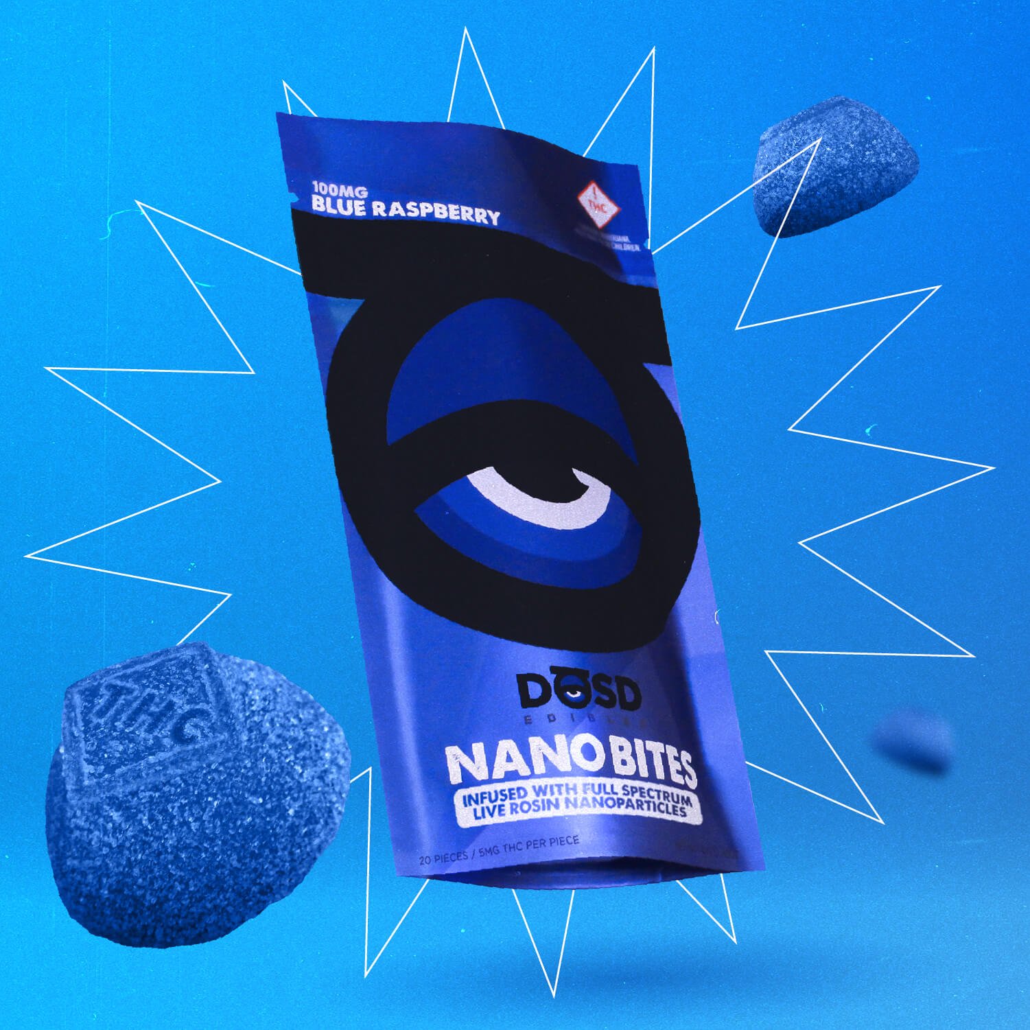
DŌSD Edibles
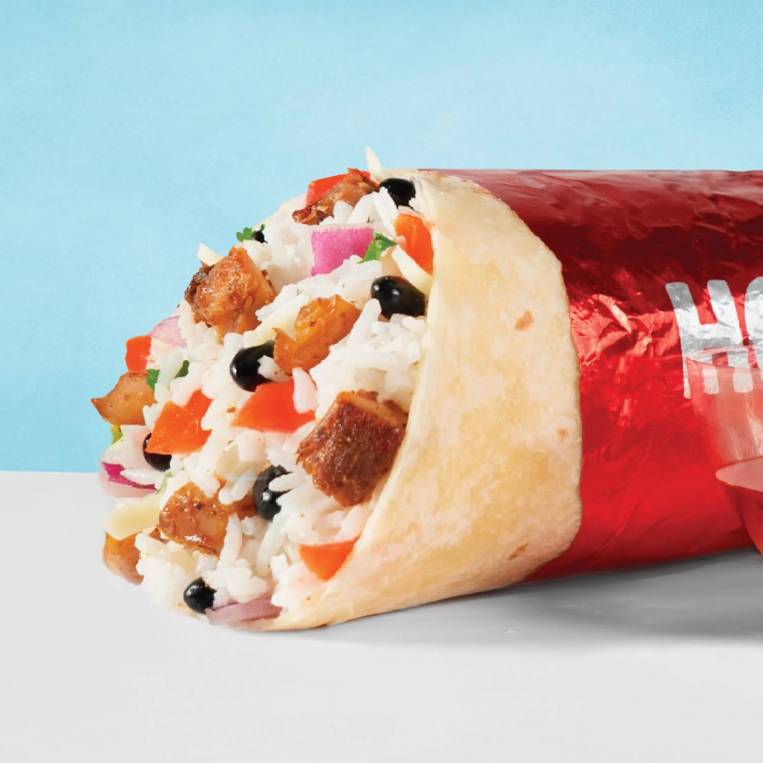
Hot Head Burritos

Puma® Golf

Where's Weed